Molecules

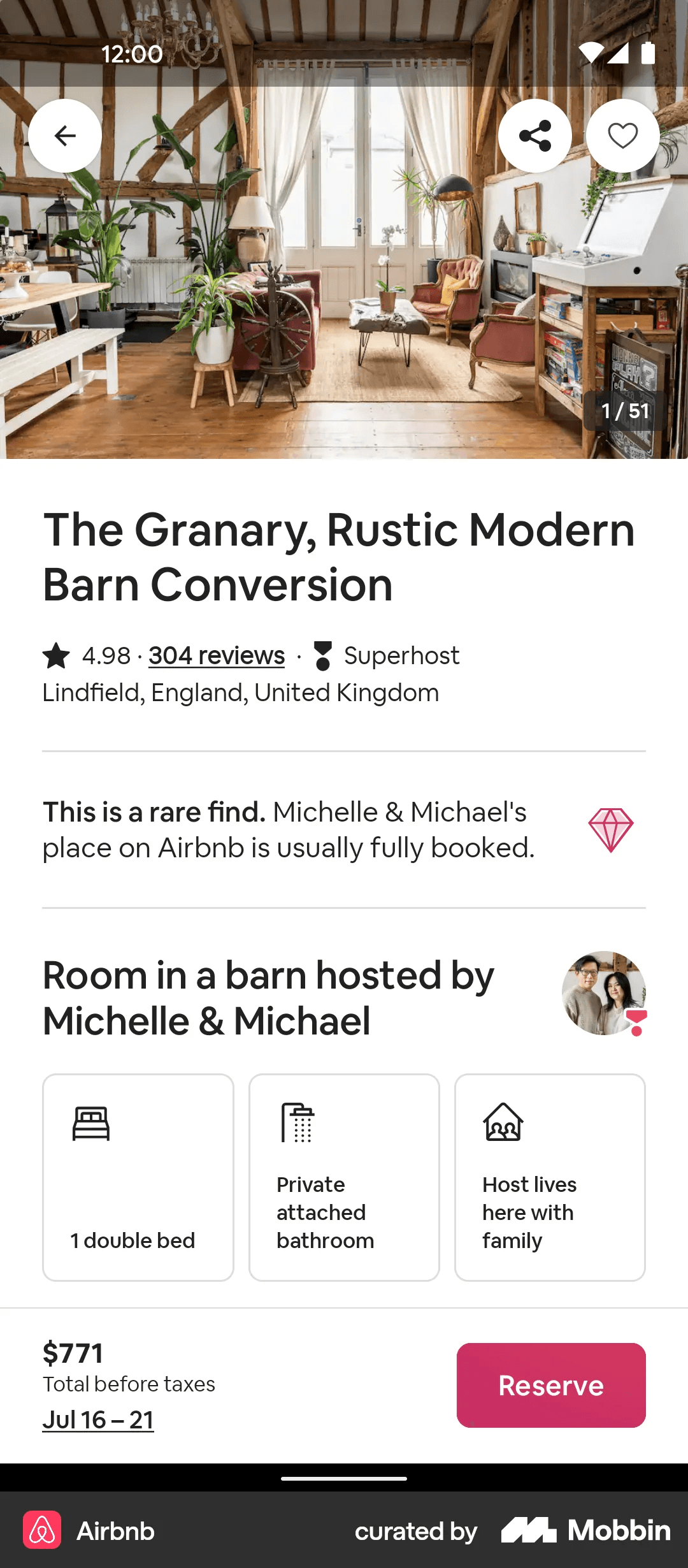
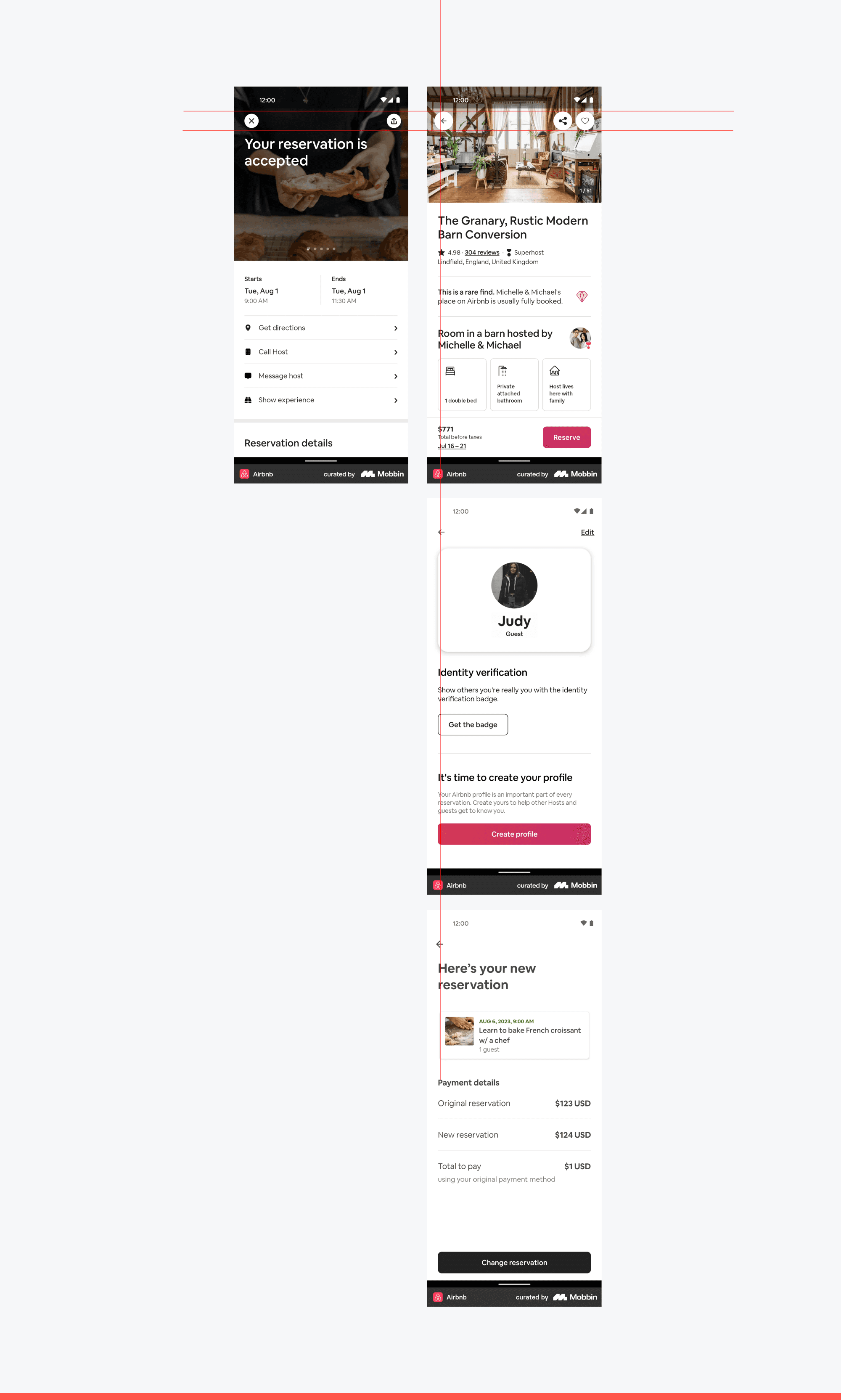
Final Screens
Overview
I worked on building the design system for Airbnb using the atomic design approach, focusing on foundational elements like colors, typography, spacing, and tokens. I developed a component library by creating key components and using them to design and redesign various pages. Throughout the process, I identified core design issues, resolved several of them.
Team
Solo
Timeline
4 months
Year
2024
Problem statement
Airbnb's design system is essential for maintaining consistency, accessibility, and efficiency across its platform. However, certain core components suffer from inconsistencies and design inefficiencies, creating challenges for both designers and developers.
This project identifies key mistakes , redesigns critical components for design consistence , and i try to builds a structured, scalable design system from the ground up
Atomic Design Framework
Atoms: Defined fundamental elements such as typography, colors, radio, Switches etc
Molecules: Created simple combinations of atoms, such as buttons , chip, Avator etc
Organisms: Built more complex components like cards, Date picker, input field , search field , navbar etc
Templates : Design templates layouts to illustrate the application of components in real-world scenarios.
Atoms
Molecules
Organsim
Colors
Main color
White
primary-70
Black
Grayscale
Grey 100
Grey 200
Grey 300
Grey 400
Grey 500
Grey 600
Grey 700
Grey 800
Grey 900
Grey 1000
White
primary-70
Black
Success
Green 100
Green 200
Green 300
Green 400
Green 500
Green 600
Green 700
Green 800
Green 900
Green 1000
Background
bg-Action-primary
primary-70
bg-Screen-gray
gray-100
bg-Screen-Default
White
bg-surface-disabled
gray-300
Border
Icon button
New color
surface-default
gray-200
surface-selected
gray-900
Dividers
Dividers
gray-200
Text
content-primary
gray-900
content-secondary
gray-500
tourtory-text
gray-400
content-disabled
gray-300
content-utility-success
Green-500
content-utility-danger
Icon
IconC-primary
gray-900
icon-secondary
gray-500
Icon-disabled
gray-300
Grid
Anatomy

1- Margin: Left and right margins on screen, this allow us to define space between elements
2- Status Bar: Top bar including elements as time, battery, service, wifi etc., displays various kinds of status information
3- Top App Bar
4- Columns
5- Gutter
6- Bottom Nav Bar
7- Home Indicator
Layout elements
0-599 dp
22 px
22 px
Margins
0-599 dp
4 columns
Columns
0-599 dp
8 px
Gutters
Add gutters to columns and rows when additional space is needed to separate content. On mobile, at a breakpoint of 599 dp, this layout grid uses 8px gutters.
Do’s and Don’ts

Don’t — Do not use inconsistent or arbitrary padding values . Avoid using non-standard values like 29px or 23px without justification.
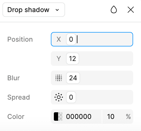
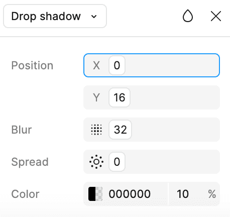
Elevation
Elevation levels
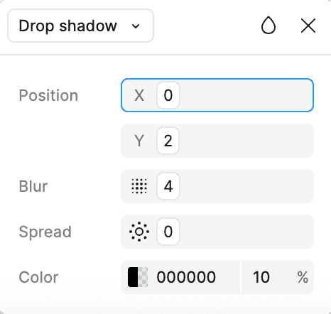
Level 1
Use for: icon button
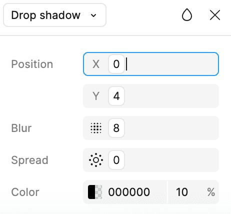
Level 2
Use for: search bar

Level 3
Use for: Card
Level 4
Use for: Tooltips and thumbnails
Level 5
Use for: Flag messages

Level 6
Do’s and Don’ts

Inconsistence in shadows
Don’t — When using components at the same level, avoid using different types of shadows.
Corner Radius
Corner Radius
4px
r100
Use for: Tags
8px
r200
Use for: Buttons , input fields
12px
r300
Use for: Search bar , popep
16 px
r400
Use for: Cards
24px
r500
Use for: large card
100px
r999 (Rounded)
Use for: chips , switches , search bar
Typography
Cereal - Typeface
Cereal is Airbnb's custom typeface, designed to reflect their brand identity and enhance readability across their platforms. It was introduced as part of Airbnb's design evolution to create a more unified and user-friendly experience.
Type Styles
Aa
Size: 32 px
Weight: Bold
Display / Large
Use for empty states and feature introductions. Top level headers. Use in moderation
Aa
Size: 22 px
Weight: Bold
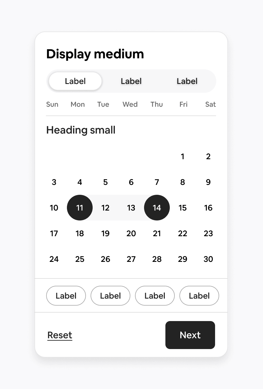
Display medium
Use for main titles
Aa
Size: 26 px
Weight: medium
Heading / large
Use for headings that identify key functionality.
Aa
Size: 22 px
Weight: medium
Heading / Medium
Use for sub-sections and group headings.
Aa
Size: 18 px
Weight: medium
Heading / Small
Use for deep headings and for highlighting important pieces of information.
Aa
Size: 16 px
Weight: Regular
Body/ Large
Use for longer-form text that is not a part of the UI. This has a larger line height and paragraph spacing than rest. Semibold style can be used for placing importance on part of a sentence, rendering the text as a heavier font weight.
Aa
Size: 14 px
Weight: Regular
Body/ Medium
Use primarily on help text under form fields, and as secondary supporting text in applications. It should be used sparingly. Semibold style can be used for placing importance and emphasis.
Aa
Size: 12 px
Weight: Regular
Body/ Small
Use for primarily supporting tertiary text in applications as labels. It’s the lowest level of body text. Semibold style can be used for placing importance and emphasis.
Aa
Size: 16 px
Weight: medium
Label large
Use for all large primary and secondary button text.
Aa
Size: 14 px
Weight: medium
Label medium
Use for all small primary and secondary button text
Aa
Size: 12 px
Weight: medium
Label Small
Use for all text button in the context of a paragraph (Body/Large). In UI components, use a Link Button instead.Underline is used only for text links (either hover state or default state, depending on the style of the link) and should never be used as a mechanism for adding emphasis.
Aa
Size: 16 px
Weight: medium
Link large
Use for all text button in the context of a paragraph (Body/Small). In UI components, use a Link Button instead. Underline is used only for text links (either hover state or default state, depending on the style of the link) and should never be used as a mechanism for adding emphasis.
Aa
Size: 14 px
Weight: medium
Link medium
Use for all text button in the context of a paragraph (Body/Small). In UI components, use a Link Button instead. Underline is used only for text links (either hover state or default state, depending on the style of the link) and should never be used as a mechanism for adding emphasis.
Aa
Size: 12 px
Weight: medium
Link small
Use for all text button in the context of a paragraph (Body/Small). In UI components, use a Link Button instead. Underline is used only for text links (either hover state or default state, depending on the style of the link) and should never be used as a mechanism for adding emphasis.
Dividers
Dividers
Types
Inset divider
Inset dividers are indented and do not span the full width of the container.
Full wight dividers
Full-width dividers span the entire width of the container.
Do’s and Don’ts
Don’t — Don’t use the different colors when using the same separator . Separators (like dividers) are not always necessary. They should only be used when they add value to the user experience. Overusing separators can make the interface feel cluttered or visually noisy.
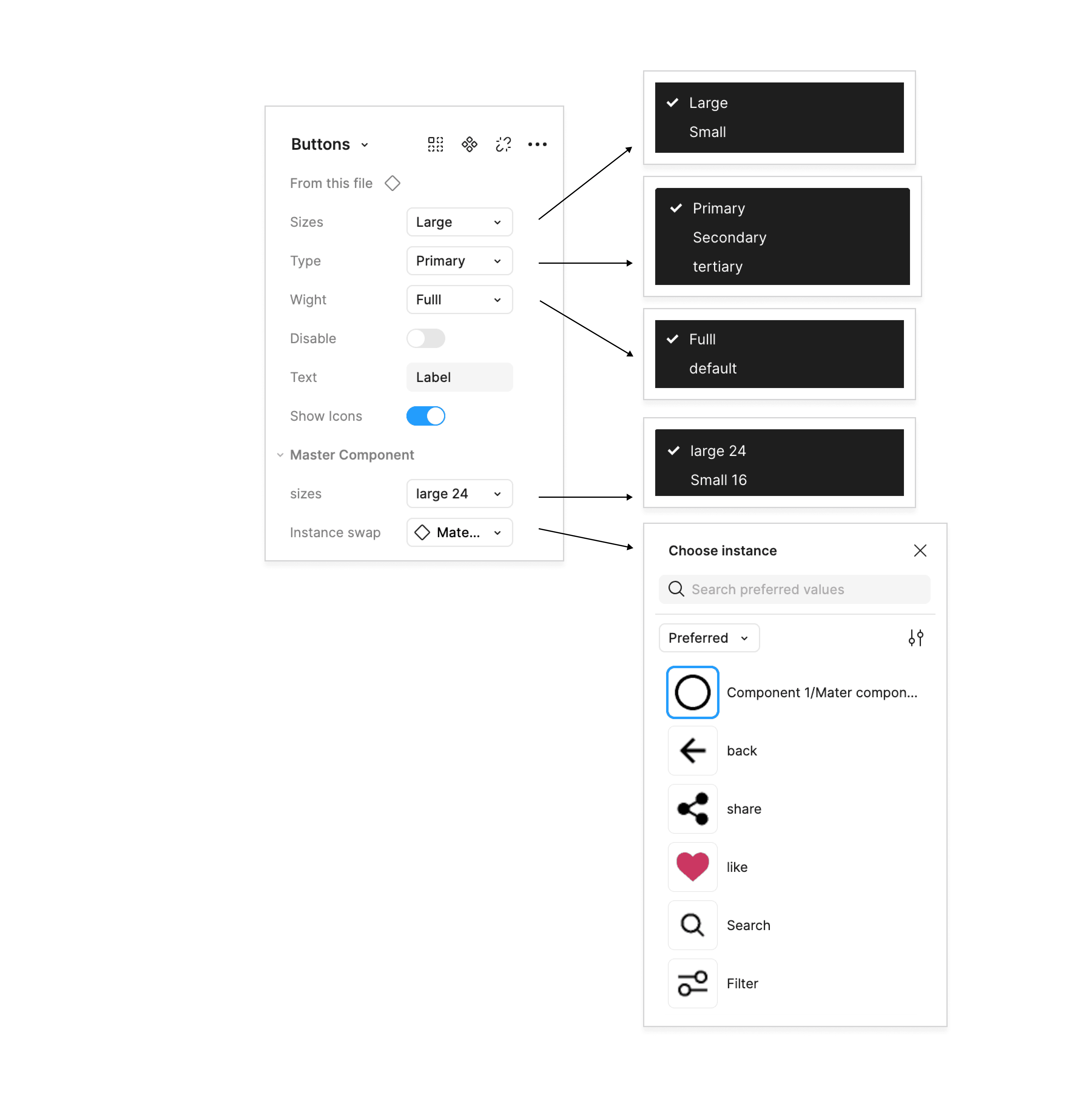
Button
Prime component
Label
3
2
1
2
2
1- Container: Area that defines the structure and touch target of the button
2- Label: A short text that states the button action
3- Icon Prefix: Visual element that adds meaning to the action
Types / Variants
Label
Primary Button
A primary button allows the user to perform primary actions in order to accomplish the most important tasks.
Label
Secondary Button
A secondary button allows the user to perform secondary or less priority actions. It captures less focus than primary button
Label
Tertiary Button
A tertiary button is the least prominent and optional type of buttons. It is usually used as text or link button to accomplish the important task
Width
Label
Label
Label
Full width
Label
Label
Label
Default
State
Label
Label
Label
Disable
Label
Label
Label
Disable
Specifications

Large button
Small button
Use case
Date component
We are using a secondary button in the date component.
Properties
Label
Do’s and Don’ts
Don’t — Do not use inconsistent button sizes for the same action type (primary button) on the same screen or flow.
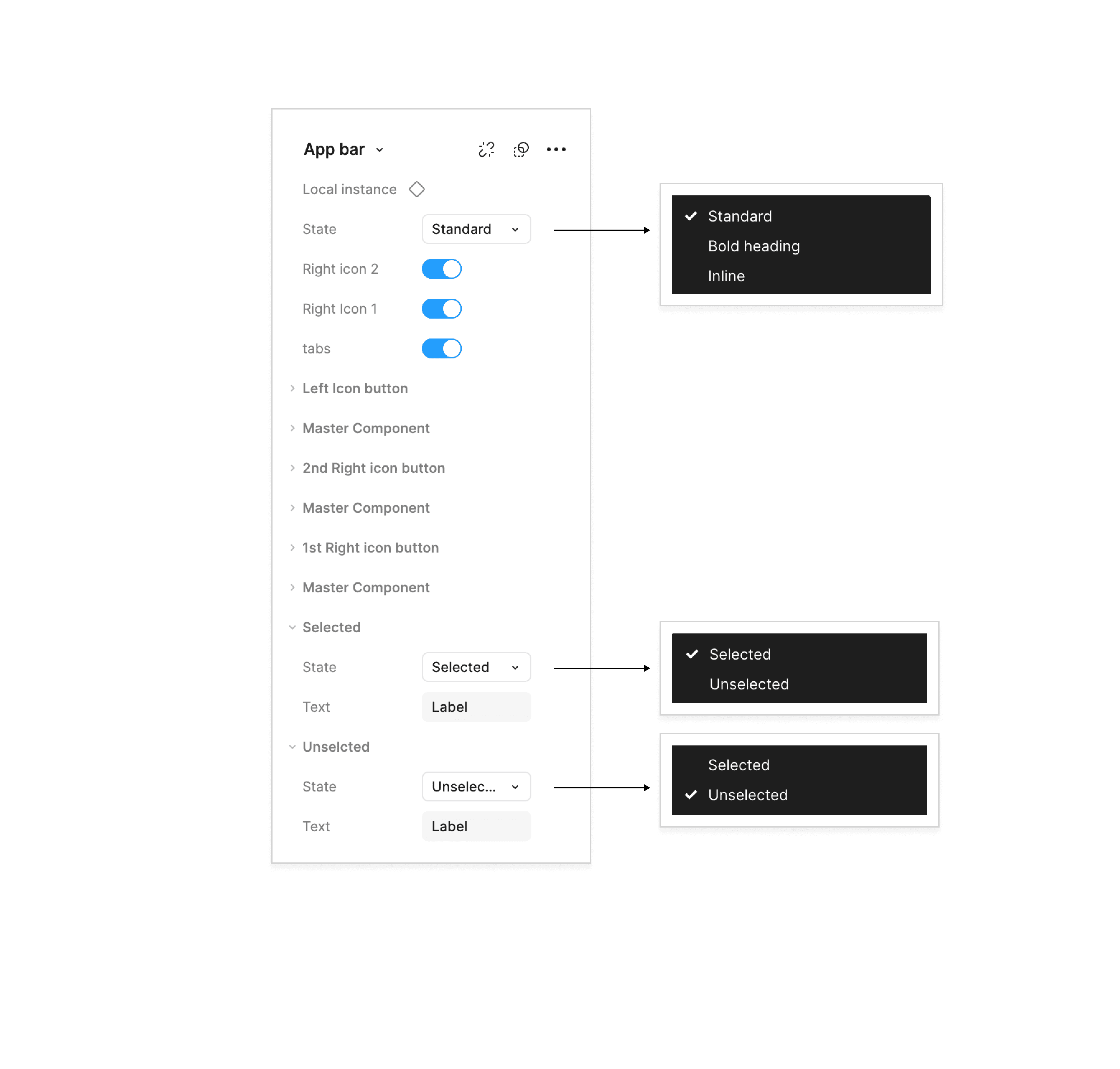
Appbar
Anatomy
Label
Label
1
2
3
2
2
2
4
1- icon left: Visual element / actions for supporting the lists content.
2- tabs: The content related to the list
3- icon right 1: Visual element / actions & text for supporting the lists content.
4- icon right 2: Visual break to separate content into clear groups.
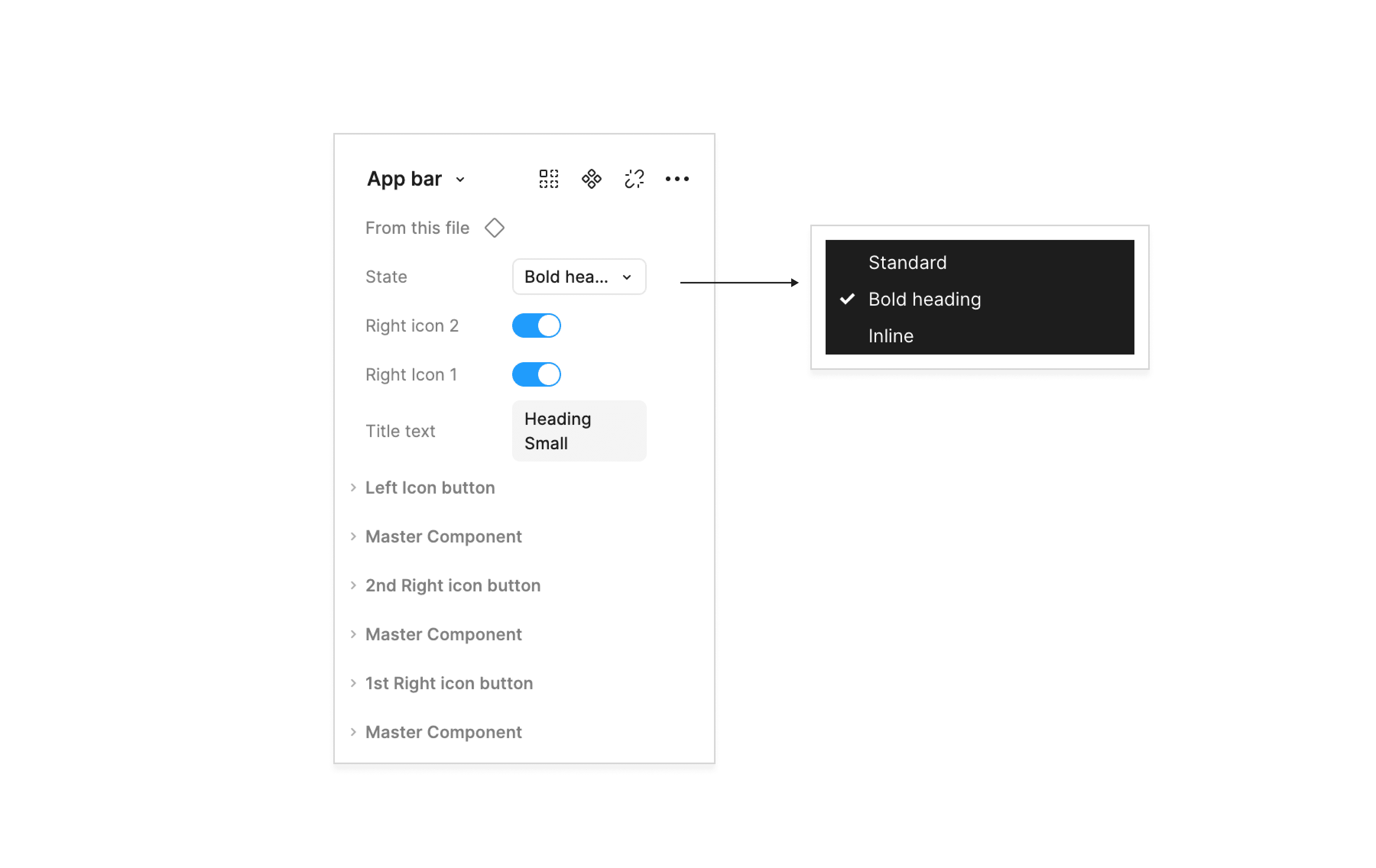
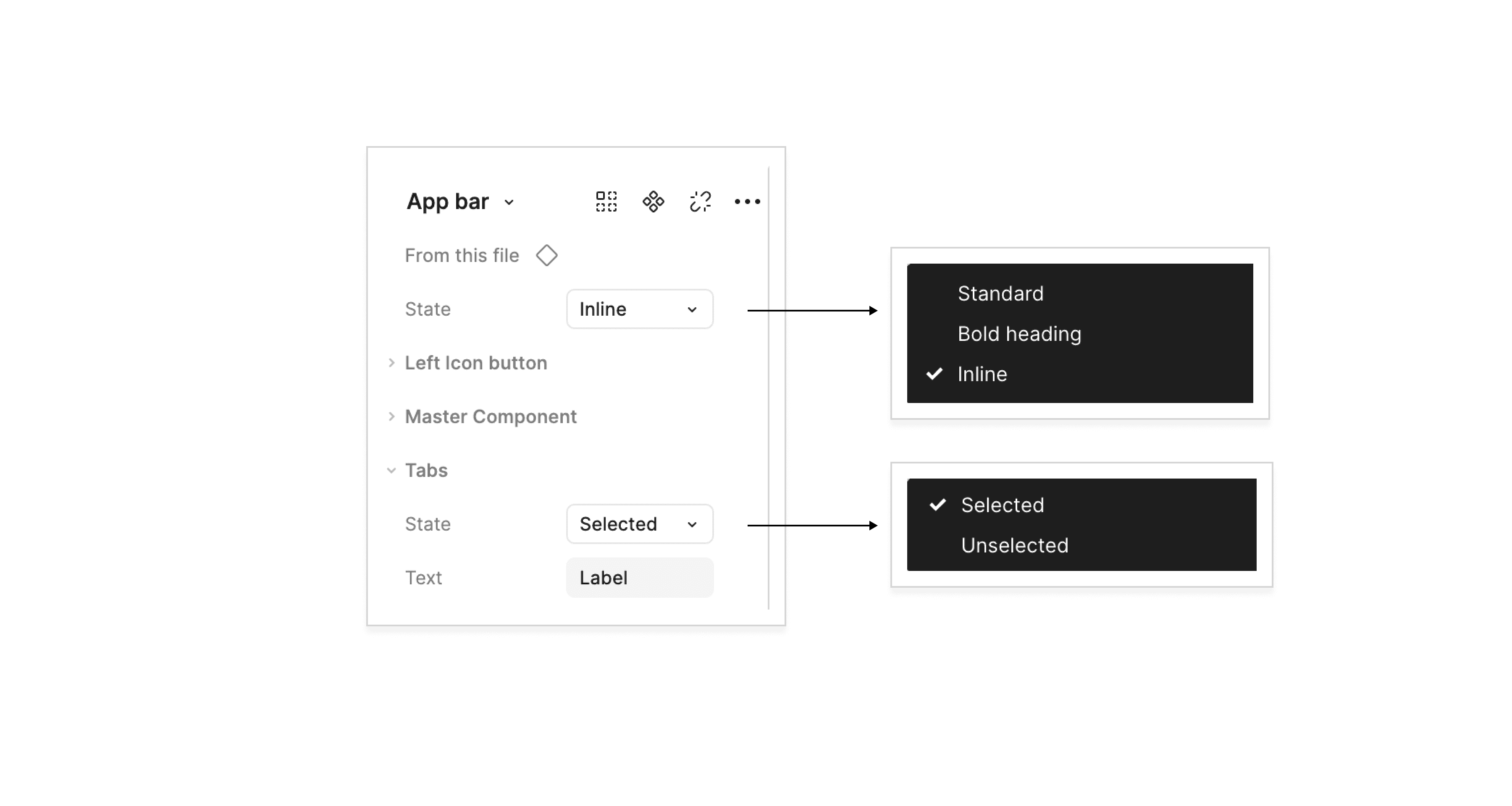
Varient Type
Label
Label
Standard
The screen title will be the same as the active tab
Heading Small
Bold heading
The screen title will be the same as the active tab
Label
Inline
The screen title will be the same as the active tab
Behaviour
Label
Label
Responsive
The list is completely responsive and can adjust to all screen sizes.
Skeleton

Use case
Use case 01

use case 02
Label
Label
Use case 03
Label

use-case 04
Use case 05
Heading Small

use-case 06
Variants Properties
Standard
Label
Label
Bold Heading
Heading Small
Inline
Label
Do’s and Don’ts
Don’t —Do not use inconsistent alignment for elements within the App Bar.
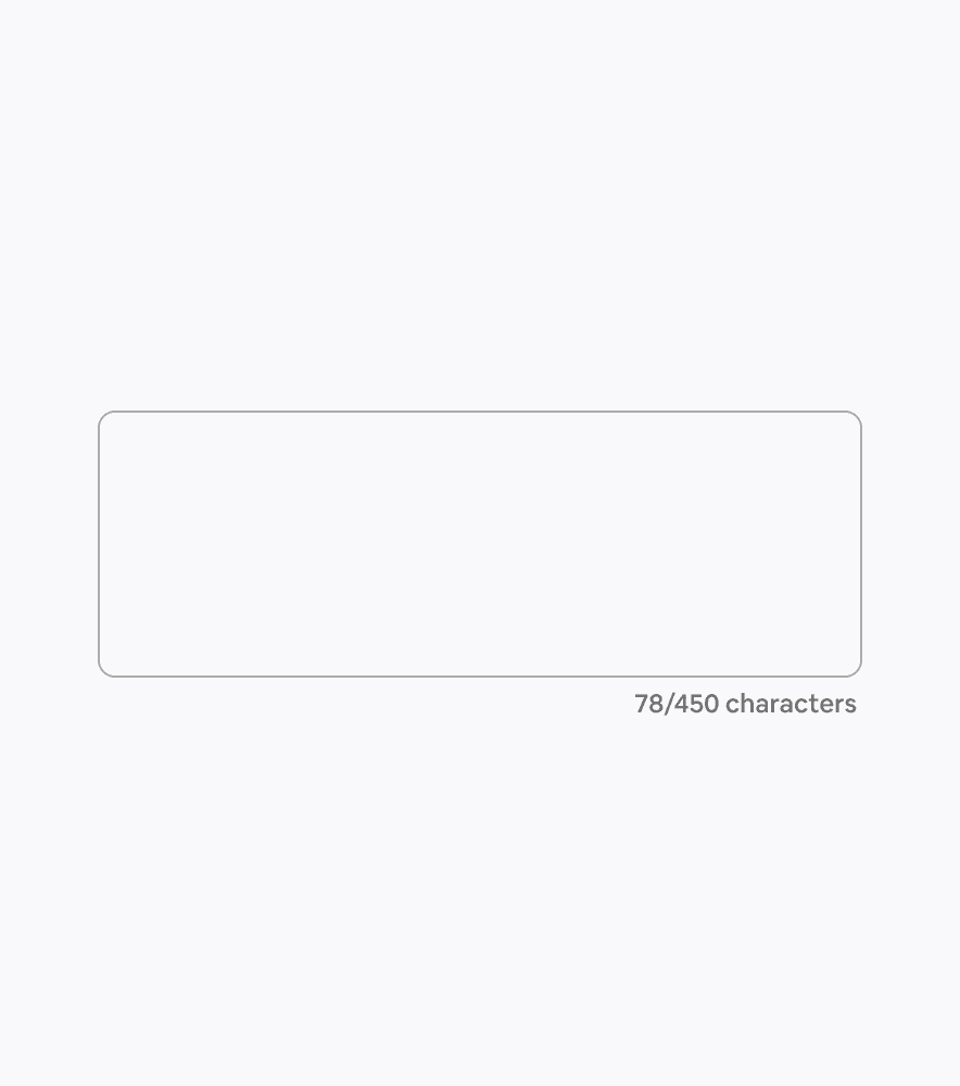
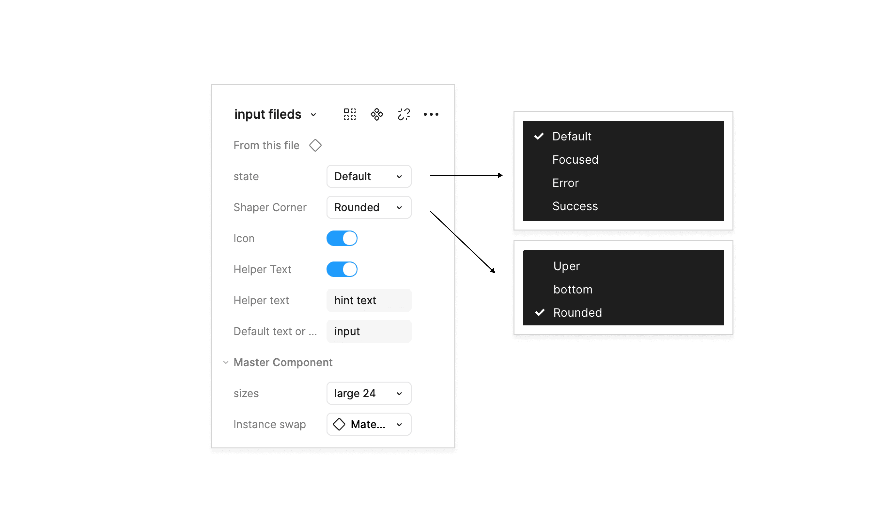
Input fields
Anatomy and Specifications

1- Input text : The actual text entered by the user.
2- Helper Text : Offers guidance or context for the user input.
6- Label text : Describes its purpose
4- Icon

1- Container
2- Counter Text : Text that displays character or word limits, often shown below or inside the field.
6- Input text : The actual text entered by the user.
Types of input field
input
hint text
Text Input
Text input let users enter and edit data.

Text Area Input
It is a multi-line text input which let users enter and edit data
States
input
hint text
Default — Denotes that the input field is currently active and can be interacted with
input
hint text
Focused — Denotes that data can be entered in the input field
input
hint text
Success — Denotes that the data entered has been verified
input
hint text
Error — Denotes that the data entered is not valid
States
Default — Denotes that the input field is currently active and can be interacted with

Focused — Denotes that data can be entered in the input field

Error — Denotes that the data entered is not valid
Behaviour

Responsive
The input field is completely responsive and can adjust to all screen sizes.
input
hint text
input
hint text
Responsive
The input field is completely responsive and can adjust to all screen sizes.
Specifications

Theming
input
hint text
Edges
input
hint text
Roundness
Properties
Active state
input
hint text
List
Anatomy
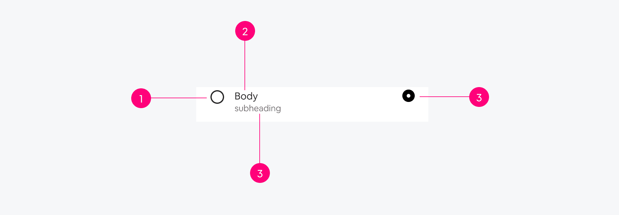
1- icon
2- Body large text
3- Body medium text
4- Radio
Varient Type
Body large
1 line
The screen title will be the same as the active tab
Body large
body medium
2 line
The screen title will be the same as the active tab
Behaviour
Body large
Body large
Responsive
The list is completely responsive and can adjust to all screen sizes.
Body large
Lorem Ipsum is simply dummy text of the printing and typesetting industry.
Body large
body medium
Auto layout
Skeleton
Variants Properties
Standard
Body large
body medium

use cases
Body large

use case 01
Body large
body medium

use case 02
Body large
use case 03
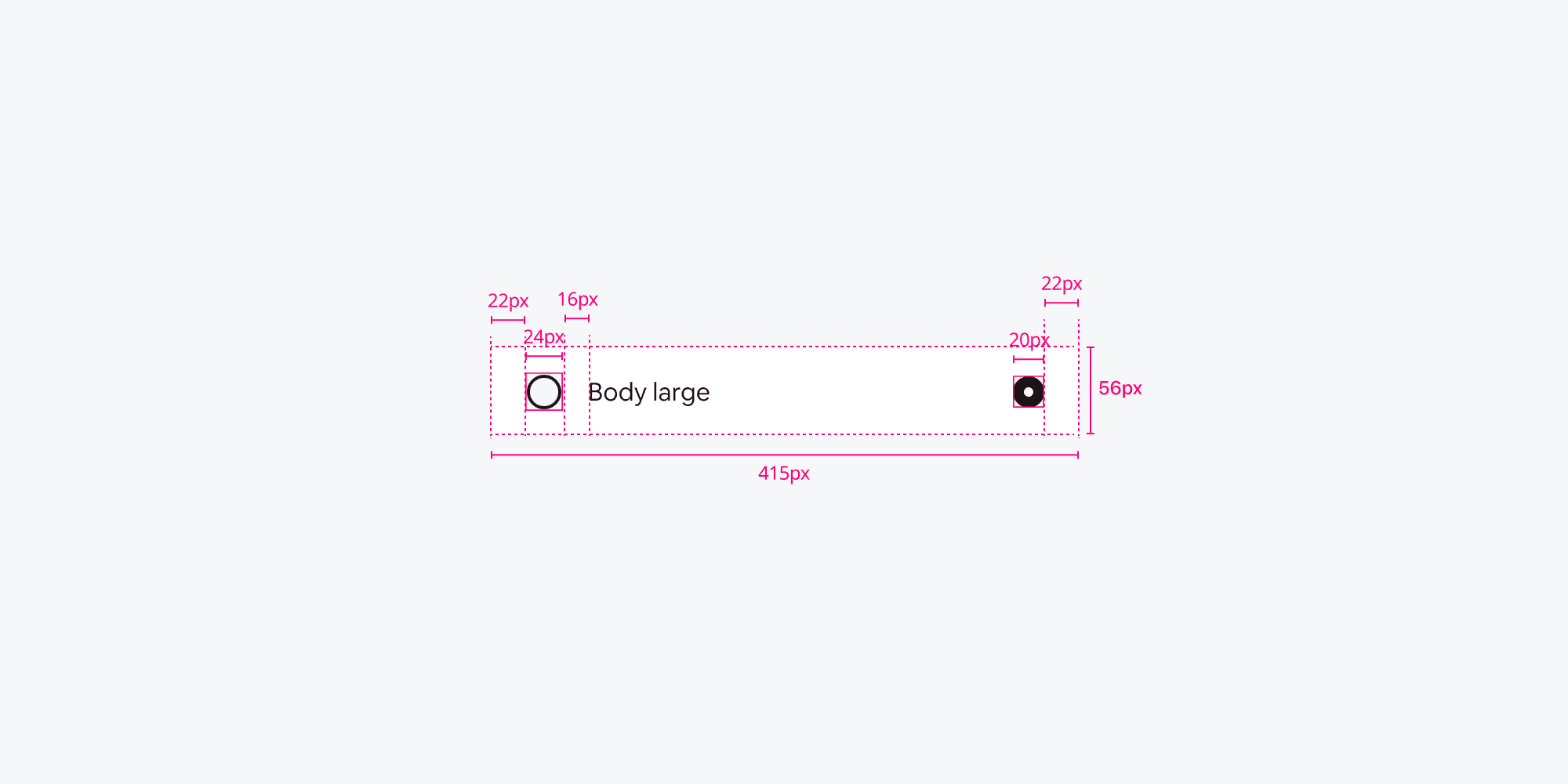
Anatomy

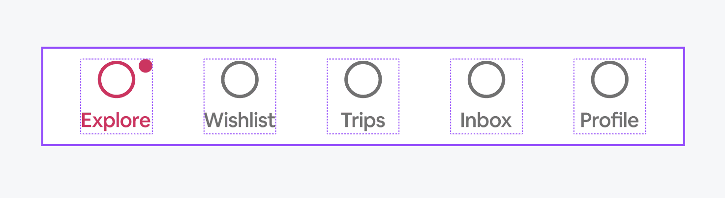
1- Icon: Represents the visual symbol for each navigation item (e.g., "Explore," "Wishlist").
Icons can have different states (active or inactive). Size and alignment should be consistent for all icons.
2- Text Label: A textual description for each navigation item. For example: "Explore," "Wishlist," "Trips."
Typography style and size are predefined for consistency.
3- Notification Badge (Optional) : A small circular element used to display notifications or status updates for specific items. It can dynamically show or hide based on the "Show notification" property.
4- Container :The entire bottom navigation component is enclosed in a fixed container with a specified width and height (e.g., 375px × 56px in the example). Ensures the component fits uniformly across devices.
Content
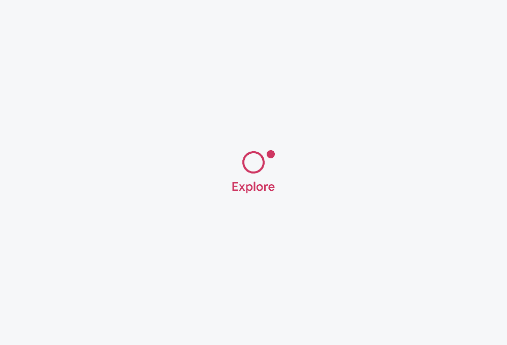
Active tab
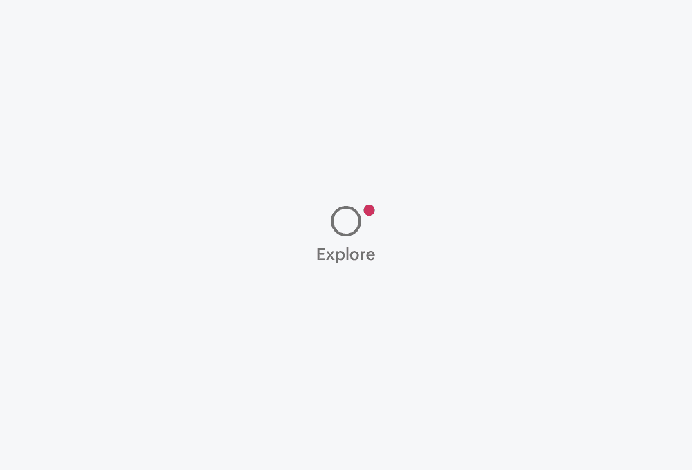
Inactive tab
Behaviour

Responsive
The list is completely responsive and can adjust to all screen sizes.
Skeleton


Use case

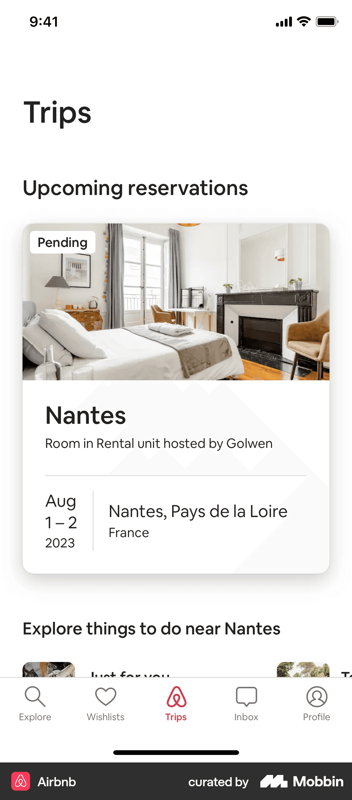
Explore
Wishlist
Trips
Inbox
Profile
Properties
Active state
